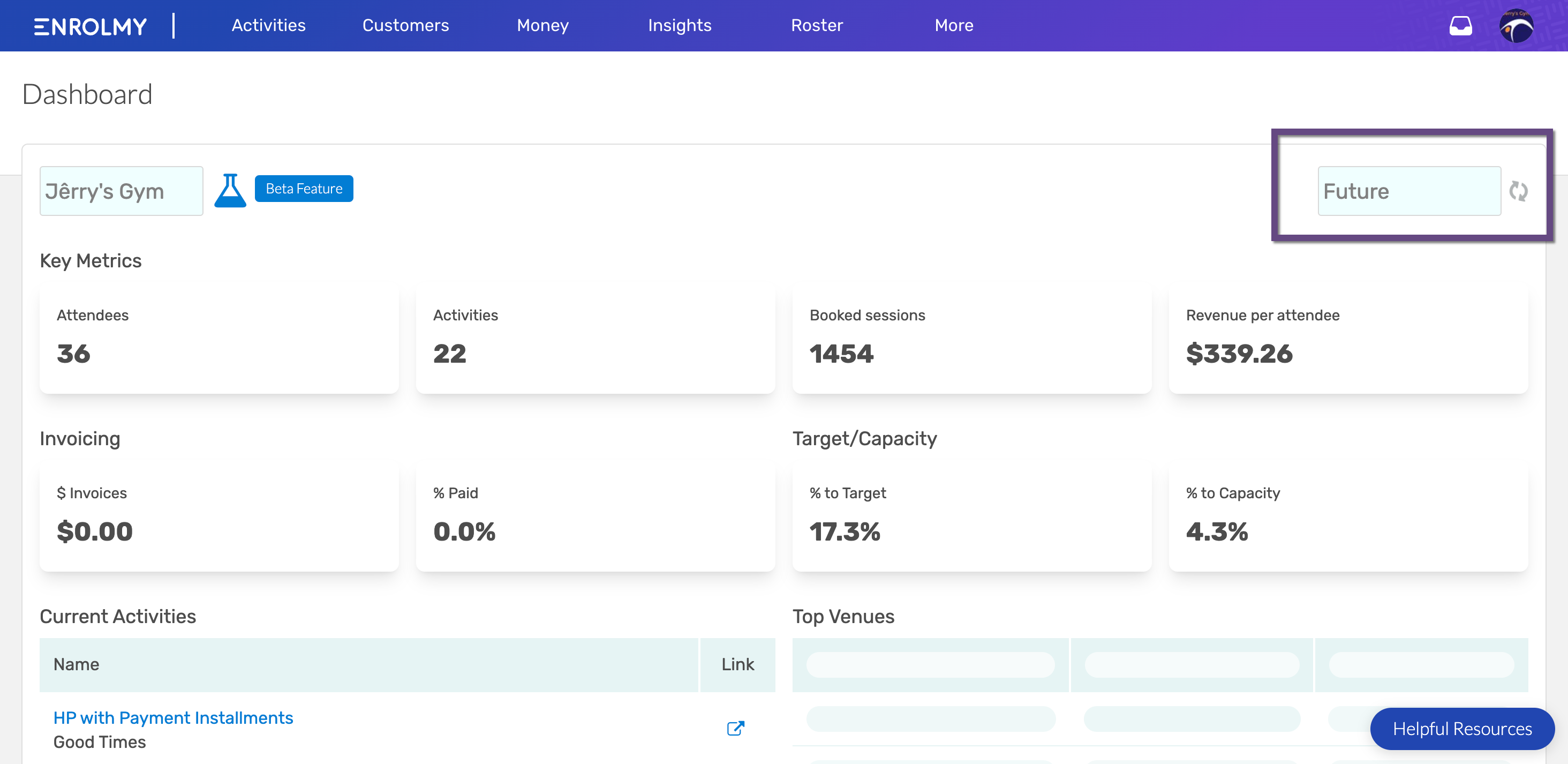
Enrolmy Dashboard
Scenarios:
You want to know more about Enrolmy’s Dashboard
This document assumes the following
You have an Office Admin or Office Support user-level access on your Enrolmy instance.
You have run or are running activities
You are using Enrolmy Rostering
What is the Enrolmy Dashboard?
Enrolmy created the Dashboard to show you how your programmes are performing in a quick glance. This report will show you a snapshot of the below within a specified time period:
Attendees
Activities
Charged sessions
Revenue per attendee
Total Invoices Amount ($)
Invoices Paid ( % )
Percent to Target
Percent to Capacity
Accessing the Dashboard
Upon logging to your Enrolmy account, the Dashboard will be shown.
If you navigated away from the Dashboard and need to see it again, just click on the Enrolmy logo on the far-left side of the screen.
Understanding the Dashboard
All the following metrics have a percentage underneath indicating if the amount is higher (green arrow) or lower (red arrow) than the previous time period. For example if the selected time period is “Past Week”, the numbers are in comparison to the week prior.
Key Metrics
Attendees
Amount of unique attendees that attended an activity
Activities
Total number of activities within the specified time range
Charged sessions
Amount of sessions booked
Revenue per attendee
Average revenue per attendee
Invoicing
$ Invoices
Sum total of invoices generated within the specified time period
Includes Draft and Approved Invoices
% Paid
Percentage of the total paid amount out of the total amount of all invoices generated
Target/Capacity
% to Target
% to Capacity
Current Activities
Shows all the current activities as seen in the current activities tab
Quick links to each activity
Top Venues
In order of total revenue generated per venue
Seeing Stats in the Future
You can choose to see the Dashboard and key insights for the future. If the “Future” timeframe is selected it is essentially like selecting “Past Week” (a week ago from the current day → today), except it would be (today → a year from today)

Awesome! You now understand the new Enrolmy Dashboard!
Last Updated:
